Bread Financial is a technology-driven company that provides lending and savings solutions to help transform consumer spending.
Project 1: Bread Loans
To help users easily consolidate their credit cards with Bread Loans, we redesigned their loan process to fix the “add card” flow. This flow allows users to add or remove cards to consolidate their debt into a single Bread Loan.
This led to an 8% increase in the success rate, a 1.5% increase in app utilization, and a 3 minute average reduction in the completion time.
Why did we make the change?
After launch, we looked at our analytics and noticed that there were a lot of rage clicks in the section that users enter their balances.
What steps did we take?
We chose to investigate further by conducting usability tests.
How did we do it?
We used usertesting.com to conduct unmoderated usability tests with 10 participants, aged 23-54, who had at least 1 credit card.
Pain points with the original design
“Details” button is easy to miss, and doesn’t look like a button
Users struggled to find their previously entered balances
Three action buttons caused way too much cognitive effort
Redesign objectives:
Can users easily find their entered balances/saved cards?
Do they know how to edit amounts or delete cards?
Does the visual treatment decrease cognitive load?
Design values:
Discoverability:
How easy is it for users to complete the task?
Efficiency
How efficient and clear is the navigation?
Simplicity
Do the visuals and copy help with processing?
Our solutions:
Users can swipe through the convenient card carousel to see their balances
Card visibility combined with simple language allows users to easily manage their cards
As the “add card” form slides in, it expands to eliminate multiple action buttons
Project 2: EasyPay
The request:
”I want to be able to quickly and easily pay my bills. Right now, it takes too long and it’s too confusing to find where to pay them.”
The solve:
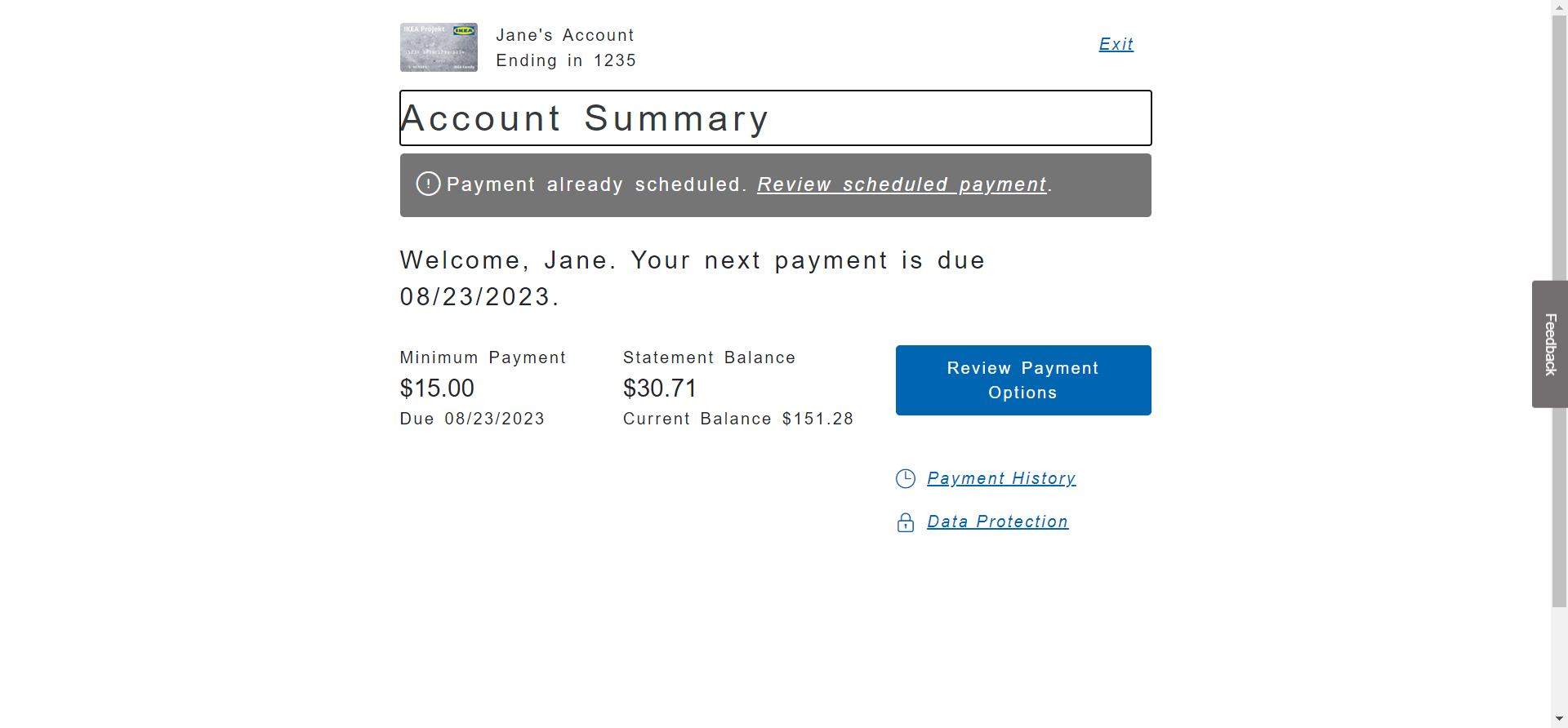
EasyPay, a resource that allows users to pay their bill without signing in—plus, gives them easy access to options like payment plans, hardship enrollment, and lump-sum re-ages.

Happy Path

User selects "Try it now" banner in the navigation to visit EasyPay

User enters their info to find their payment

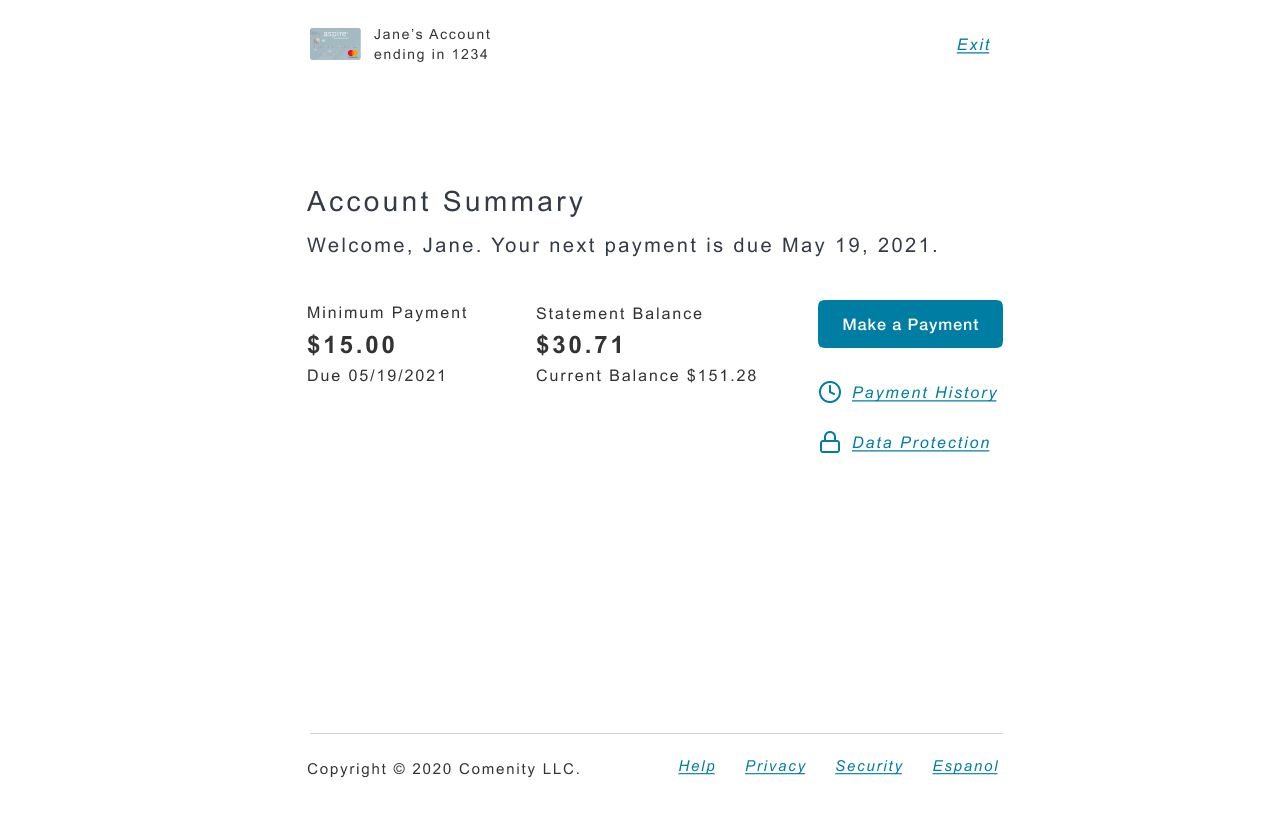
Summary page showing payment info

User must agree to T&C's to activate button

User agrees to terms and button is active

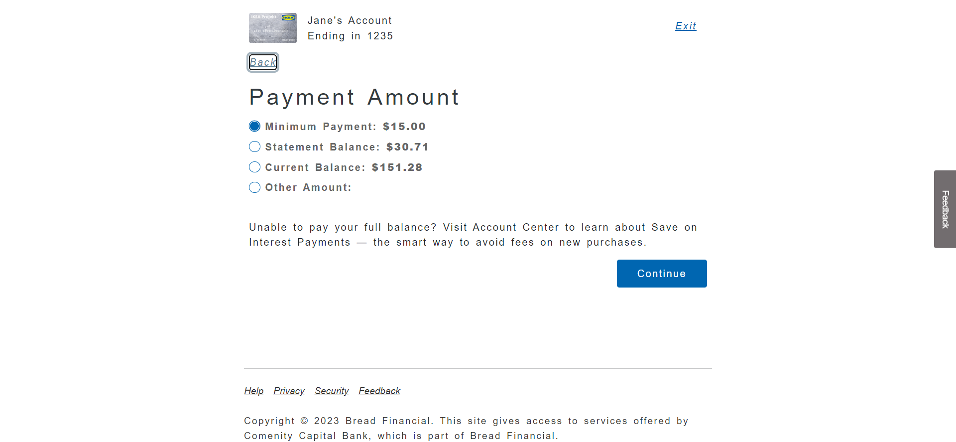
User selects payment amount

User selects payment date

User selects payment method

User selects checkbox indicating they authorize payment

CTA is now active

Payment is successful and user can enter email for confirmation

Delinquent Accounts

User with no missed payments, with messaging related to their next due date

1 missed payment with a gentle and information message; user might have made a mistake or forgot to pay

2 missed: inform user that they have options, and we can help

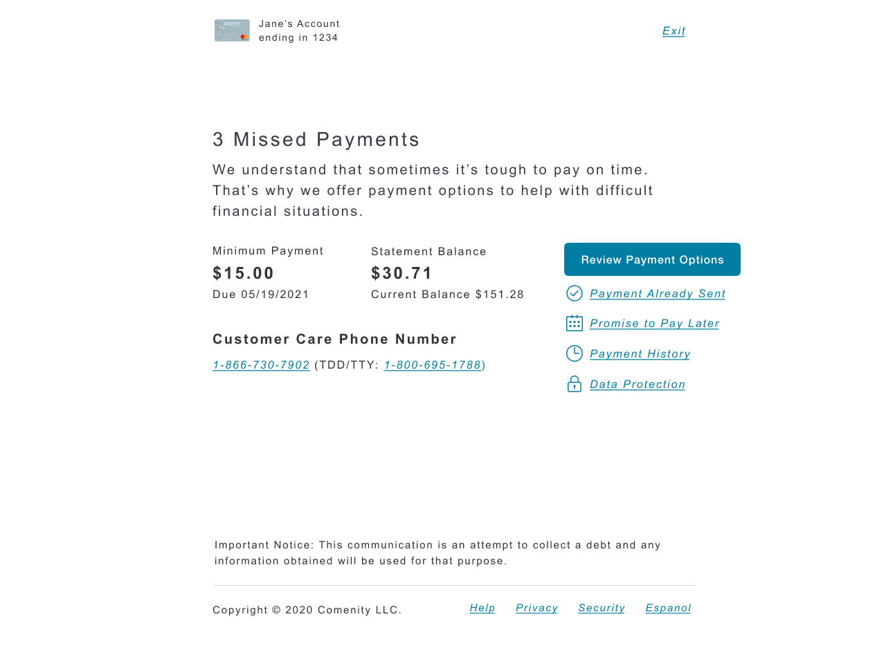
3 missed: acknowledge difficulty and provide payment option

4 missed: increased urgency around messaging and payment options

5 missed: show severity of delinquency and let the user know what will happen if they don't pay

6 missed: introduce time element and reiterate what actions they need to take, and what will happen if they don't

7 missed: at the highest severity, users are no longer able to take advantage of payment options and must make a payment to avoid closure
Project 3: AI Virtual Assistant/Chatbot
I partnered with developers at Nuance to write content that solved user concerns, especially with regards to the redesign and rebranding of the Comenity site.
Visio Flows
User asks about AutoPay
Virtual Assistant gives user the option to:
1. set up automatic payments
2. edit them
3. cancel payments
with direct links and guidance
User wants a balance transfer
Virtual Assistant identifies:
1. if user is signed in (if not, prompts them to sign into account center with link)
2. if user’s card qualifies for balance transfer.
2a. If not, do not allow user to proceed.
2a. If so, ask user if they have a question or are interested in a new offer.
3. Determine if the offer is available for the requested account.
User wants to apply for a new card
Virtual Assistant searches for card name and card type
If the card type is integrated or hybrid cards, user is provided with the client’s application page on their external website
If the card type is internal, user is redirected to apply on Comenity’s application page.


